SA Scrapbook Convention Chapter 4
and then we had Candice Greenway. i had heard alot about her, and saw her layouts on the front cover of Scrapping & Kie, and always thought that everything looked so busy and overwhelming. all the work it seemed that went into the layouts, the detail......and then she gave us the recipe. when you bake a cake, you get all your ingredients together. in themselves they might not seem like anything, but when you add them together, you get (hopefully!!) a great tasting cake! she also taught a bit about design principles - i know lots of people did not like the fact that she taught us a few things at the beginning and gave some design principles - she did tell everyone that we would not finish the layout, just do the preparation, and i for one, always enjoy getting tips from people who have been scrapping for a while. to the "negatives" out there - there has to be a reason she is used by Scrapping & Kie and why she was asked to teach at the convention. same goes for Jowilna Nolte that taught last year. different ingredients, chocolate and vanilla cake. i love all kinds of cake, so i am always happy to learn a new recipe! she had her little puppy on the page - she also admitted to feeding it biltong for sitting still, and dressing her up ( in retrospect, that is also ok. i like natural photos, but there is something to be said for a beautiful studio photograph!!)
here is a close up of some of the detail. she designed a sheet of rubons ( that were great to rub, as i HATE rubons - i always have the worst luck) and the circle stampsets - no sugar added and SWEET.
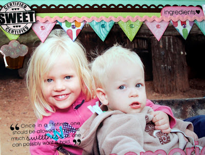
i used a range of photos of my other nephew's kids ( thank goodness for big families and an aunt that loves her camera when you don't have kids of your own!!!) this layout was hard work to finish. i am not used to placing things perfectly on a page and making them line up. i just normally plonk them down. here i had to measure, line up, chalk lots of little pieces, make sure all the little photos are the same size ( and they are not) and in the end it was worth it. we can either stick to the same thing or we can challenge ourselves to do something different. if we don't like it, and we don't have to do it to survive, then i guess we don't have to do it again. i will definately use some elements from this layout again. now, off to finish the last ones..................enjoy your Sunday, the wind is blowing us away. i will see you later!


Comments